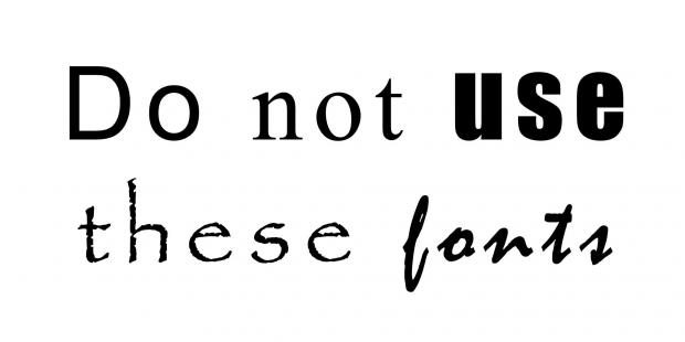
Whether it’s a flyer, social media graphic or your website, there are some fonts to avoid.
It’s not that these fonts are necessarily bad or ugly, but most have been so overused or unprofessional that they will automatically reduce the quality of your work. Ready to see the list of fonts to avoid? Let’s do it.
1. Arial
 We may as well start with the basics. The first font on our list is none other than Arial.
The Arial typeface comes standard on all modern computers and boasts at least twenty different variations but none of these variations warrant use in your designs. Arial is the poor man’s Helvetica and one of the reasons designers dislike this font is because it aims to copy Helvetica while not paying any royalties or mentions to its inspiration. And to prove this isn’t simply typographers cynicism, Windows boldly proclaimed in 1992 that Arial was indeed an, “alternative to Helvetica.”
Aside from the aforementioned typography conspiracy, we dislike Arial primarily because of its blandness. It’s dull and plain. And while it may serve as a justifiable type for a secondary title or body of text, we’d prefer you use an alternative.
2. Times New Roman
 Ok, now let’s move on to another overused font. Times New Roman is the oldest font on this list commissioned in 1931. Moreover, it is used frequently in North American paperbacks and is one of the most widely used typefaces in history.
However, while Times has distanced itself from the shackles of Microsoft in recent years, it still remains so widely used that we would suggest avoiding it on your marketing materials.
3. Comic Sans
 Above we mentioned earlier, not all the fonts in this list are truly bad, they’ve simply been overused. However, Comic Sans is not one of these fonts. This font is absolutely horrible.
It was released in 1994 by Microsoft and designed by a man named Vincent Connare. Connare was known for creating child-oriented fonts and he based this specific font off of a collection of Batman comics in his office. True story. And that is the precise problem with this font – it’s childish. Using this font will immediately lower the quality of whatever you’re promoting.
The only conceivable scenario in which this font would be remotely acceptable is for some sort of children’s marketing. And even then, there are a plethora of other fonts that could adequately replace it.
4. Papyrus
 Chris Costello designed this font and released it in 1983. It was hand-drawn over a period of six months and was designed to imitate what the English language would look like if it was written on papyrus several millennia ago.
So you might ask, with such a noble and beautiful origin, how could this font be on the list of terrible typefaces? Simple, it’s overused. It’s so overused in fact that Costello the creator said it had lost its original appeal and been diluted.
From Avatar, to National Geographic, to Arizona brand Iced Tea, Papyrus is everywhere, but one place it shouldn’t be is on your marketing materials.
5. Impact
 Last on our list is the font Impact. Impact is popular because it is designed to do just that – impact the reader. It uses wide strokes and compressed spacing to do just that. And this is why it has been used on so many posters and publications. However, due to this appeal, the fonts ironic overuse has left it unable to make an impact at all.
There are plenty of wide fonts that will convey your message in impactful ways but Impact is not one of them.
Are there other fonts to avoid that you feel should be on our list? Drop us a comment and let us know!
Looking for guidance on how to structure your brand and/or marketing materials? Contact us today for a FREE consultation.

